Seeing the Wood for the Trees
By Carl Goodwin in R
January 1, 2019

In Criminal Goings-on faceting offered a way to get a sense of the data. This is a great visualisation tool building on the principle of small multiples. There may come a point though where the sheer volume of small multiples make it harder to “see the wood for the trees”. What’s an alternative strategy?
library(tidyverse)
library(trelliscopejs)
library(rbokeh)
library(kableExtra)
library(janitor)
library(wesanderson)
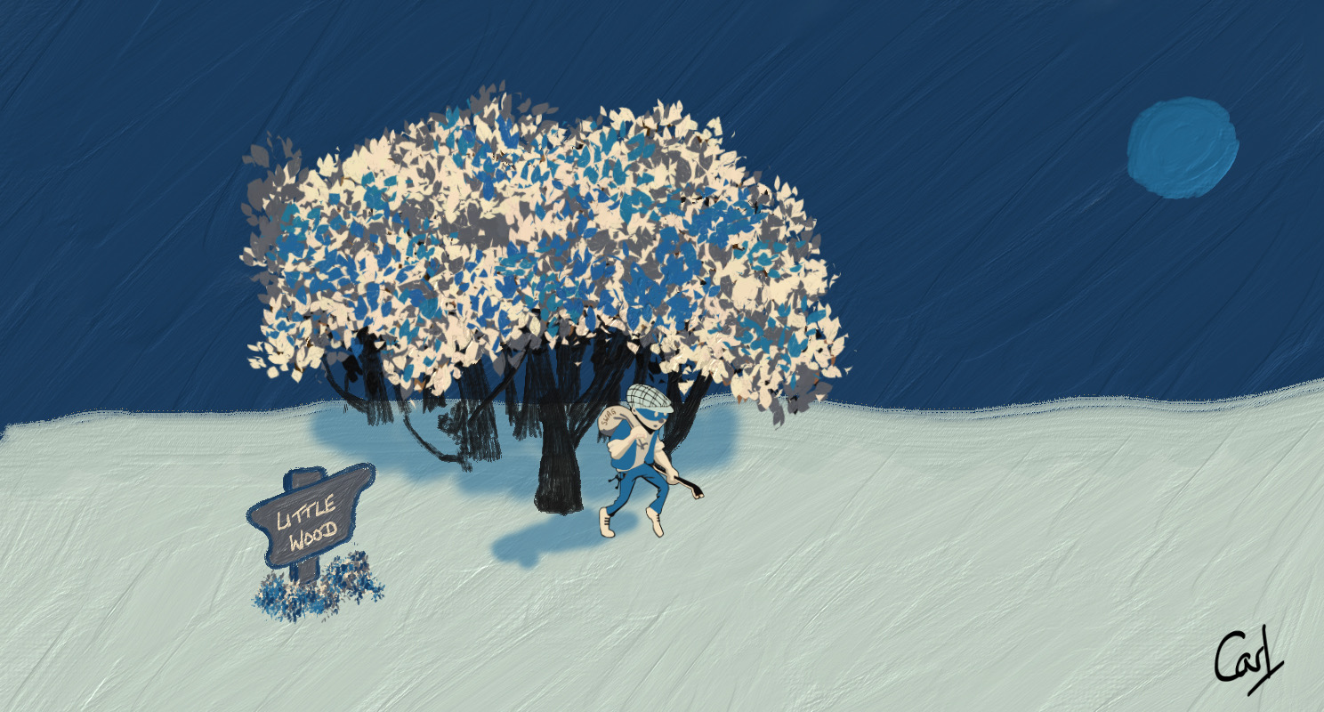
This time I’ll use a custom palette to align with the 5-colour Adobe Fresco palette used for the feature image. However, there are 9 types of criminal offence, so colorRampPalette will enable the interpolation of an extended set.
theme_set(theme_bw())

cols <- c("#2A3C5C", "#B9C1B8", "#EEDEC1", "#41638E", "#606268") |>
  fct_inorder()

tibble(x = 1:5, y = 1) |>
  ggplot(aes(x, y, fill = cols)) +
  geom_col() +
  geom_label(aes(label = cols), size = 4, vjust = 2, fill = "white") +
  annotate(
    "label",
    x = 3, y = 0.5,
    label = "Custom Pallette",
    fill = "white",
    alpha = 0.8,
    size = 6
  ) +
  scale_fill_manual(values = as.character(cols)) +
  theme_void() +
  theme(legend.position = "none")

cols9 <- colorRampPalette(cols)(9)
The data need a little tidy-up.
url <- str_c(
  "https://data.london.gov.uk/",
  "download/recorded_crime_rates/",
  "c051c7ec-c3ad-4534-bbfe-6bdfee2ef6bb/",
  "crime%20rates.csv"
)

crime_df <-
  read_csv(url, col_types = "cfcfdn") |>
  clean_names() |>
  mutate(
    year = str_extract(year, "(?:1999|200[0-9]|201[0-7])"),
    year = as.numeric(year)
  ) |>
  group_by(year, borough, offences) |>
  summarise(number_of_offences = sum(number_of_offences)) |>
  filter(
    offences != "All recorded offences",
    !borough %in% c(
      "England and Wales",
      "Met Police Area",
      "Inner London",
      "Outer London"
    )
  )
This was the original visualisation in
Criminal Goings-on using ggplot’s facet_wrap.
crime_df |>
  mutate(borough = str_wrap(borough, 11)) |>
  ggplot(aes(year, number_of_offences, colour = offences, group = offences)) +
  geom_line() +
  facet_wrap(~borough, scales = "free_y", ncol = 4) +
  labs(
    x = NULL, y = NULL, title = "London Crime by Borough",
    colour = "Offence", caption = "Source: data.gov.uk"
  ) +
  scale_colour_manual(values = cols9) +
  guides(colour = guide_legend(nrow = 3)) +
  theme(
    strip.background = element_rect(fill = cols[4]),
    legend.position = "bottom",
    axis.text.x = element_text(angle = 45, hjust = 1)
  )

There are some nice alternatives which allow one to go deeper into the data whilst making the whole experience more consumable and engaging.
Switching facet_wrap for facet_trelliscope is a simple option. Or trelliscope may be used in combination with the rbokeh or plotly packages. Irrespective of the option chosen, one can more flexibly display the several hundred “small multiple” panels required to go deeper into the crime data.
Pairing trelliscope with rbokeh permits the addition of some custom cognostics and additional interactivity. The slope cognostic, for example, enables filtering on the boroughs and types of offence exhibiting the steepest upward or downward trends.
slope <- function(x, y) {
  coef(lm(y ~ x))[2]
}

plot_data <- crime_df |>
  group_by(borough, offences) |>
  nest() |>
  ungroup() |>
  mutate(
    additional_cogs = map_cog(
      data,
      ~ tibble(
        slope = cog(slope(.x$year, .x$number_of_offences),
          desc = "Steepness of the trend"
        ) |>
          round(2),
        mean_count = cog(mean(.x$number_of_offences),
          desc = "Average count"
        ),
        iqr_count = cog(IQR(.x$number_of_offences),
          desc = "Interquartile range"
        )
      )
    ),
    panel = map_plot(
      data,
      ~ figure(xlab = "Date", ylab = "Count") |>
        ly_lines(year, number_of_offences, color = cols[5], width = 2, data = .x) |>
        ly_points(year, number_of_offences,
          size = 10,
          fill_color = cols[9],
          hover = number_of_offences, data = .x
        ) |>
        theme_plot(
          background_fill_color = cols[2],
          background_fill_alpha = 0.5
        )
    )
  )
iframe may be used to display the interactive app on this page. Or, if preferred full-screen, the self-contained app is served
here on this blogdown site.
R Toolbox
Summarising below the packages and functions used in this post enables me to separately create a toolbox visualisation summarising the usage of packages and functions across all posts.
| Package | Function |
|---|---|
| base | as.character[1]; as.numeric[1]; c[3]; conflicts[1]; cumsum[1]; function[2]; list[2]; mean[1]; round[1]; search[1]; sum[2] |
| dplyr | filter[6]; arrange[2]; desc[2]; group_by[3]; if_else[3]; mutate[7]; summarise[2]; ungroup[1] |
| forcats | fct_inorder[1] |
| ggplot2 | aes[3]; annotate[1]; element_rect[1]; element_text[1]; facet_wrap[1]; geom_col[1]; geom_label[1]; geom_line[1]; ggplot[2]; guide_legend[1]; guides[1]; labs[1]; scale_colour_manual[1]; scale_fill_manual[1]; theme[2]; theme_bw[1]; theme_set[1]; theme_void[1] |
| grDevices | colorRampPalette[1] |
| janitor | clean_names[1] |
| kableExtra | kbl[1] |
| purrr | map[1]; map2_dfr[1]; possibly[1]; set_names[1] |
| rbokeh | figure[1]; ly_lines[1]; ly_points[1]; theme_plot[1] |
| readr | read_csv[1]; read_lines[1] |
| stats | coef[1]; IQR[1]; lm[1] |
| stringr | str_c[6]; str_count[1]; str_detect[2]; str_extract[1]; str_remove[2]; str_remove_all[1]; str_starts[1]; str_wrap[1] |
| tibble | as_tibble[1]; tibble[4]; enframe[1] |
| tidyr | nest[1]; unnest[1] |
| trelliscopejs | cog[3]; map_cog[1]; map_plot[1]; sort_spec[1]; trelliscope[1] |
- Posted:
- January 1, 2019
- Updated:
- April 29, 2022
- Length:
- 4 minute read, 676 words
- Categories:
- R
- Tags:
- apps
- See Also:
- Plots Thicken
- Digging Deep